WpfAnimation
Introduce
This is a WPF animation library that includes several animation components, such as common animation components, animated number control, continuous path animation control, path flow animation control, geometry morph animation control, particle animation control and grid animation control.
Using the animation components requires adding references and resource files
xmlns:ctrl="clr-namespace:IceSky.WpfAnimation.Controls;assembly=IceSky.WpfAnimation"
xmlns:anim="clr-namespace:IceSky.WpfAnimation.GridAnimations;assembly=IceSky.WpfAnimation"
<Window.Resources>
   <ResourceDictionary>
      <ResourceDictionary.MergedDictionaries>
            <ResourceDictionary Source="pack://application:,,,/IceSky.WpfAnimation;component/Generic.xaml"/>
      </ResourceDictionary.MergedDictionaries>
   </ResourceDictionary>
</Window.Resources>
You can view samples at the following path: IceSky.WpfAnimation.Sample
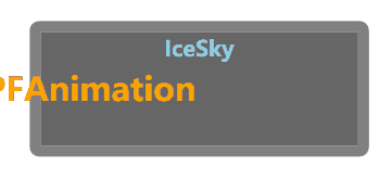
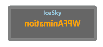
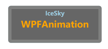
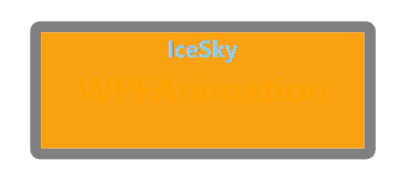
Common animation components
This component is an encapsulation of common animation types, which can reduce the code when defining animations, support the combination of multiple animations, and the library contains a large number of predefined animation definitions that can be used directly. It also allows specifying the animation trigger method.
Basic Usage
Add namespace
xmlns:cfg="clr-namespace:IceSky.WpfAnimation.Models;assembly=IceSky.WpfAnimation"Add animation properties to the controls that need animation in the Xaml file. Some basic animations have already been added to the resource dictionary, and can be used according to the resource name.
<TextBlock Text="Animation" cfg:AnimatedElement.Trigger="Loaded">
  <cfg:AnimatedElement.Animations>
      <cfg:AnimationCollection>
          <cfg:AnimationSetting BasedOn="{StaticResource AS_SkewX}" RepeatBehavior="Forever"
              AutoReverse="True"/>
      </cfg:AnimationCollection>
  </cfg:AnimatedElement.Animations>
</TextBlock>
Configuration Parameter
Trigger: supports methods such as Loaded, MouseDown, MouseEnter, MouseLeave, MouseOver, KeyDown, DataTrigger, etc.
- MouseDown can specify the mouse button
- KeyDown can specify a keyboard key
- DataTrigger can specify the trigger data value
MouseOver method will trigger the animation when enter and automatically execute the reverse animation when the mouse leave
The sample code for specifying a key when use KeyDown trigger:
<Button cfg:AnimatedElement.Trigger="KeyDown" cfg:AnimatedElement.TriggerKey="X" cfg:AnimatedElement.TriggerModifierKeys="Ctrl"/>DataTrigger with bool value:
<TextBlock cfg:AnimatedElement.Trigger="DataTrigger" cfg:AnimatedElement.DataTriggerValue="{Binding ElementName=chkPlay,Path=IsChecked}"/>DataTrigger with text:
<Ellipse cfg:AnimatedElement.Trigger="DataTrigger" cfg:AnimatedElement.DataTriggerValue="{Binding ElementName=txtDataTrigger,Path=Text}"
  cfg:AnimatedElement.TriggerStartValue="start" cfg:AnimatedElement.TriggerStopValue="stop"/>
You can use AnimationCompleted to set an animation completion event, for example:
<Button cfg:AnimatedElement.AnimationCompleted="AnimationCompleted" cfg:AnimatedElement.Trigger="MouseClick"/>AnimationType: supports Double, Color, Thickness, Point, CornerRadius
The Color type can specify shape fill, shape stroke, control foreground, control background, and border color. You can specify them using simple property names, and the corresponding target property names when setting them are: FillColor, StrokeColor, Background, Foreground, BorderColor
You need to set either one value or four values for CornerRadius animation. One value indicates that all four corner radius are the same. If you want to specify them individually, you must provide four values, representing top-left, top-right, bottom-right, and bottom-left, respectively. For example, ToValue="0 15 0 0" means setting the top-right corner radius to 15, with no radius on the other corners.
TargetProperty: Set the target property that the animation changes, which needs to match the AnimationType
Animation support animating Blur and Shadow Effects. The Blur Effect can only animate the blur radius, with the property name is: Blur; the Shadow Effect can animate the blur radius, opacity, depth, and direction, with the property names are: ShadowBlur, ShadowOpacity, ShadowDepth, ShadowDirection
The Point type can animate gradient brushes, includ StartPoint and EndPoint of LinearGradientBrush, and GradientOrigin of RadialGradientBrush, when animating these, the property names need to be specified completely, like: Fill.(LinearGradientBrush.StartPoint), Fill.(LinearGradientBrush.EndPoint), Fill.(RadialGradientBrush.GradientOrigin)
Animation parameters: include FromValue, ToValue, ByValue, Duration(ms), BeginTime(ms), CenterX, CenterY, EasingType, EasingMode, RepeatBehavior, AutoReverse, UseMidSwing
If you need the animation of RenderTransform to be based on the center of the element, you need to explicitly specify RenderTransformOrigin=".5 .5"; if not specified, the default value is the top-left corner
Set UseMidSwing to True allows swinging between From and To, with the end value being the middle value of From and To
AnimationSetting can use BasedOn for inheritance, and after inheritance, animation parameters can be overridden
Child elements of AnimationCollection can use a combination of AnimationCollection and AnimationSetting, but AnimationCollection cannot use BasedOn for inheritance
Configuration Examples
Click to expand
FadeIn:
<cfg:AnimationSetting
 AnimationType="Double" TargetProperty="Opacity"
 FromValue="0" ToValue="1" Duration="1000"/>

FadeOut:
<cfg:AnimationSetting
 AnimationType="Double" TargetProperty="Opacity"
 FromValue="1" ToValue="0" Duration="1000"/>

FromLeft:
<cfg:AnimationSetting
 AnimationType="Double" TargetProperty="X"
 FromValue="-100" ToValue="0" Duration="1000"/>
ToRight:
<cfg:AnimationSetting
 AnimationType="Double" TargetProperty="X"
 FromValue="0" ToValue="100" Duration="1000"/>

FlipX:
<cfg:AnimationSetting
 AnimationType="Double" TargetProperty="ScaleX"
 FromValue="-1" ToValue="1" Duration="1000"/>
SkewX:
<cfg:AnimationSetting
 AnimationType="Double" TargetProperty="AngleX"
 FromValue="-30" ToValue="30" Duration="1000"/>

ShakeY:
<cfg:AnimationSetting  UseMidSwing="True"
 AnimationType="Double" TargetProperty="Y"
 FromValue="-5" ToValue="5" Duration="1000"
 AutoReverse="True" RepeatBehavior="4x"/>
Foreground:
<cfg:AnimationSetting
 AnimationType="Color" TargetProperty="Foreground"
 FromValue="Orange" ToValue="DodgerBlue" Duration="1000"/>

Background:
<cfg:AnimationSetting
 AnimationType="Color" TargetProperty="Background"
 FromValue="Orange" ToValue="Purple" Duration="1000"/>
MarginGrow:
<cfg:AnimationSetting
 AnimationType="Thickness" TargetProperty="Margin"
 ByValue="10" Duration="1000"/>

BorderGrow:
<cfg:AnimationSetting
 AnimationType="Thickness" TargetProperty="BorderThickness"
 ByValue="10" Duration="1000"/>

Shadow:
<cfg:AnimationSetting
 AnimationType="Double" TargetProperty="ShadowDirection"
 FromValue="0" ToValue="360" Duration="1000"/>

Blur:
<cfg:AnimationSetting
 AnimationType="Double" TargetProperty="Blur"
 FromValue="0" ToValue="5" Duration="1000"/>
BounceIn:
<cfg:AnimationCollection>
  <StaticResource ResourceKey="AS_BounceInX"/>
  <StaticResource ResourceKey="AS_BounceInY"/>
</cfg:AnimationCollection>
Pulse:
<cfg:AnimationCollection>
  <StaticResource ResourceKey="AS_PulseX"/>
  <StaticResource ResourceKey="AS_PulseY"/>
</cfg:AnimationCollection>

RotateIn:
<cfg:AnimationCollection>
  <StaticResource ResourceKey="AC_ScaleIn"/>
  <StaticResource ResourceKey="AS_RotateCW"/>
</cfg:AnimationCollection>

ScaleOut:
<cfg:AnimationCollection>
  <StaticResource ResourceKey="AS_FadeOut"/>
  <StaticResource ResourceKey="AC_ScaleOut"/>
</cfg:AnimationCollection>
SwingIn:
<cfg:AnimationCollection>
  <cfg:AnimationSetting BasedOn="{StaticResource AS_RotateCW}" FromValue="-10" ToValue="10" UseMidSwing="True" RepeatBehavior="3x" Duration="1000"/>
</cfg:AnimationCollection>
BackInDown:
<cfg:AnimationCollection>
  <cfg:AnimationSetting BasedOn="{StaticResource AS_FadeIn}"/>
  <cfg:AnimationSetting BasedOn="{StaticResource AS_MoveFromUp}"/>
  <cfg:AnimationSetting BasedOn="{StaticResource AS_ScaleInX}" FromValue="1" ToValue="1.2"BeginTime="500"/>
  <cfg:AnimationSetting BasedOn="{StaticResource AS_ScaleInY}" FromValue="1" ToValue="1.2"BeginTime="500"/>
</cfg:AnimationCollection>
SweepToRight:
<cfg:AnimationCollection>
  <cfg:AnimationSetting BasedOn="{StaticResource AS_WidthGrow}" FromValue="0" ByValue="{x:Null}" AutoReverse="True" EasingType="SineEase"/>
  <cfg:AnimationSetting BasedOn="{StaticResource AS_BackgroundColor}" FromValue="#038f" ToValue="#38f" AutoReverse="True"/>
</cfg:AnimationCollection>
SpeedIn:
<cfg:AnimationCollection>
  <cfg:AnimationSetting BasedOn="{StaticResource AS_MoveFromLeft}"/>
  <cfg:AnimationSetting BasedOn="{StaticResource AS_SkewX}" FromValue="30" ToValue="0"/>
  <cfg:AnimationSetting BasedOn="{StaticResource AS_SkewX}" FromValue="0" ToValue="-20"BeginTime="500" Duration="200"/>
  <cfg:AnimationSetting BasedOn="{StaticResource AS_FadeIn}" Duration="300"/>
  <cfg:AnimationSetting BasedOn="{StaticResource AS_SkewX}" FromValue="-20" ToValue="0" BeginTime="700" Duration="200"/>
</cfg:AnimationCollection>
OutLine:
<cfg:AnimationCollection>
  <cfg:AnimationSetting BasedOn="{StaticResource AS_BorderGrow}" FromValue="0" ToValue="5 0 0 0" Duration="200"/>
  <cfg:AnimationSetting BasedOn="{StaticResource AS_BorderGrow}" FromValue="5 0 0 0" ToValue="5 5 0 0" Duration="200" BeginTime="200"/>
  <cfg:AnimationSetting BasedOn="{StaticResource AS_BorderGrow}" FromValue="5 5 0 0" ToValue="5 5 5 0" Duration="200" BeginTime="400"/>
  <cfg:AnimationSetting BasedOn="{StaticResource AS_BorderGrow}" FromValue="5 5 5 0" ToValue="5" Duration="200" BeginTime="600"/>
</cfg:AnimationCollection>
Animated number control
Animated number control implements a smooth transition animation for number: when the target value changes, the number will automatically smoothly increment/decrement from the old value to the new value, supporting custom animation duration and number display format.
Basic Usage
Add namespace
xmlns:control="clr-namespace:IceSky.WpfAnimation.Controls;assembly=IceSky.WpfAnimation"Use control in xaml
<control:AnimatedNumber AnimationDuration="1000" TargetValue="{Binding Text}"/>Parameters (all parameters support data binding)
- TargetValue: The animation runs automatically when the target value changes
- AnimationDuration: Animation duration (milliseconds)
- NumberFormat: The default format is 'F0', supporting C: currency format, E: scientific notation, F: fixed-point format, N: number format. A number can be added after the format to indicate the number of decimal places.
- EasingPower: Animation easing intensity (the larger the value, the slower the ending), range 1~7
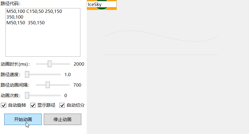
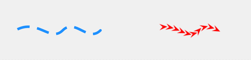
Continuous path animation control
Continuous path support allows any control to move continuously along one or more paths, while combined path support provides an automatic segmentation feature.
Basic Usage
Add namespace
xmlns:control="clr-namespace:IceSky.WpfAnimation.Controls;assembly=IceSky.WpfAnimation"Use control in xaml
<control:PathAnimationControl AnimationDuration="2000"
                           PathData="{Binding Text}" >
   <!--Code for controls that need to move along a path-->
   ………
</control:PathAnimationControl>
Parameters (all parameters support data binding)
- PathData: supports PathData and GeometryGroup for a single path, the setting method for GeometryGroup:
<control:PathAnimationControl.PathData> <GeometryGroup> <PathGeometry Figures="M50,100 C150,50 250,150 350,100"/> <PathGeometry Figures="M50,150 L150,150"/> <PathGeometry Figures="M50,200 A150,50 0 1 1 350,200"/> </GeometryGroup> </control:PathAnimationControl.PathData> - AnimationDuration: Path animation duration (milliseconds), if SplitFigures is true, it is the animation duration for each segment of the path
- PathSpeed: Effective when the AnimationDuration is 0, the larger the value, the faster the speed, the minimum value is 1
- PathDelay: The interval time between multiple paths (milliseconds). If there is only one path, it is the interval time for the looping animation
- AutoRotate: Whether to automatically rotate angle when moving along the path
- RepeatCount: Number of animation loops, 0 means infinite looping
- ShowPath: Whether to display the path, default is false, meaning it is not displayed
- SplitFigures: Whether to automatically split paths. If the path code is a GeometryGroup, it will automatically split according to its Children; otherwise, it will be determined whether to split its figures based on this parameter.
- PathData: supports PathData and GeometryGroup for a single path, the setting method for GeometryGroup:
Animation control method
- StartAnimation
- StopAnimation
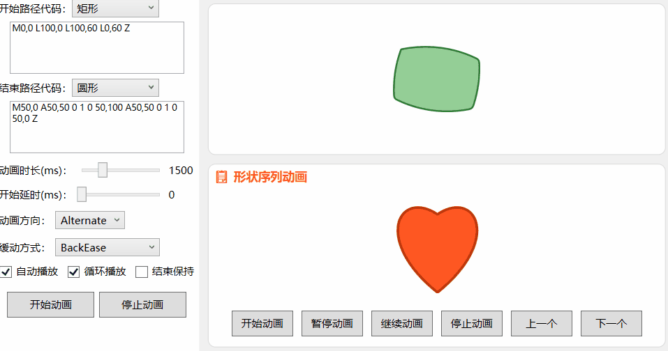
Geometry morph animation control
This control implements morph animation for two or a group of shapes, supports defining shapes using paths, and allows specifying the animation direction
Basic Usage
Add namespace
xmlns:control="clr-namespace:IceSky.WpfAnimation.Controls;assembly=IceSky.WpfAnimation"Use control in xaml
<control:GeometryMorphControl
     FromGeometry="{Binding From}"
     ToGeometry="{Binding To}"/>
Parameters (all parameters support data binding)
FromGeometry: Start Shape Path
ToGeometry: End shape path
AutoPlay: Whether to automatically play the animation when loaded, default is false
IsLooping: Whether to loop the animation, default is false
AnimationDirection: Include Forward (default), Reverse, Alternate
HoldEnd: Whether to maintain the end shape when the animation ends
BeginTime: Delay time at the start of the animation (milliseconds), set the interval time between animations
AnimationDuration: Duration of an animation (milliseconds)
Fill: Set Fill of Shape
Stroke: Set Strok of Shapee
StrokeThickness: Set StrokeThickness of Shape
EasingFunction: Set the animation easing function
GeometryList: Set the shape list, can be defined using resources in the Xaml file:
<x:Array x:Key="StandardShapes" Type="{x:Type sys:String}">
    <sys:String>M0,0 L100,0 L100,100 L0,100 Z</sys:String>
    <sys:String>M50,0 A50,50 0 1 0 50,100 A50,50 0 1 0 50,0 Z</sys:String>
</x:Array>
then use the resource in the control
<control:GeometryMorphControl GeometryList="{StaticResource StandardShapes}"/>
Animation control method
- StartMorphAnimation: Start one Morph animation
- StopAllAnimations
- StartPlayList: Start animation for shape list
- PauseAnimation
- ResumeAnimation
- Previous: Switch to the previous shape in the list
- Next: Switch to the next shape in the list
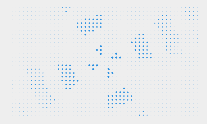
Particle animation control
This is a common particle animation control with a large number of parameters, supporting the setting of particle templates, contour shapes, various motion modes, and animation effects.

Basic Usage
Add namespace
xmlns:control="clr-namespace:IceSky.WpfAnimation.Controls;assembly=IceSky.WpfAnimation"Use control in xaml
<control:ParticleVisualHost ParticleCount="100"/>Parameters (all parameters support data binding)
- ParticleCount: Number of particles
- ParticleShape: Built-in particle shapes, include Circle (default), Square, Triangle
- ParticleTemplate: Specify the particle template, default is null, which means using the built-in particle shape. You can use DataTemplate to define the particle template. Using a custom template will consume more resources, so the number of particles should be reduced
- ContourPath: Particle area contour shape path, default is null, indicating that the default circular contour is used. You can use Geometry to define the contour path
- DurationSeconds: Particle Duration (seconds)
- MinParticleSize: Minimum particle size
- MaxParticleSize: Maximum particle size
- SpawnPosition: Particle generation position, include Center (default), Surround, EvenlyDistributed, Line
- MoveDirection: Particle motion direction, include ToSurround (default), ToCenter, SpecifiedDirection, Rotation, ScatterFrom, GatherTo
- MoveSpeedMin: Minimum particle velocity
- MoveSpeedMax: Maximum particle velocity
- AnimationDistance: Particle movement distance, this setting is related to particle speed and particle duration. If the particle dies too early, it will not reach this distance. When the value is 0, the particle movement distance will be determined by DurationSeconds and speed.
- IsCollisionEnabled: Whether to enable collision bounce. When enabled, reaching the edge of the container will cause a collision and bounce, default is false
- IsAutoAnimation: Whether to automatically start the animation
- IsContinuous: Whether it is a continuous animation, when is ture, particles will continue to be generated
- IsInfiniteLoop: Whether to loop infinitely. When enabled, the animation will loop infinitely; otherwise, it will play only once. The default is true
- InnerRangeSize: The boundary when the SpawnPosition is Center
- OuterRangeSize: The boundary when the SpawnPosition is Surround
- ParticleHorizontalAlignment: Horizontal alignment of the particle area
- ParticleVerticalAlignment: Vertical alignment of the particle area
- SpawnOffsetX: The offsetX of SpawnPosition
- SpawnOffsetY: The offsetY of SpawnPosition
- MinColor: Minimum color of the particles
- MaxColor: Maximum color of the particles
- MinOpacity: Minimum opacity of the particles
- MaxOpacity: Maximum opacity of the particles
- ScaleStart: Scale ratio when particle generated
- ScaleEnd: Scale ratio when particle disappear
- ScaleSpeedFactor: The larger the value, the slower the change
- XJitterRange: The range of X-axis jitter
- YJitterRange: The range of Y-axis jitter
- JitterSpeed: Jitter speed factor, the larger the value, the faster the jitter, and the range will become smaller.
- IsFixedRotationCenter: Whether the rotation center is fixed when rotating as a whole. By default, it is not fixed and rotates around the center of the interface. Otherwise, you can set GlobalRotationCenterX and GlobalRotationCenterY to specify the rotation center.
- GlobalRotationSpeed: Overall rotation speed, the larger the value, the faster the rotation. The default is 0, which means no overall rotation.
- Different motion parameters can be set according to the direction of movement
- When the direction is set to Rotation, you can set RotateAngularSpeed (the larger the value, the faster the speed) and IsClockwise (rotation direction, default is true for clockwise).
- When the direction is set to SpecifiedDirection, you can set SpecifiedDirectionAngle (translation direction, the value is an integer representing the angle: 0 right, 90 down, 180 left, 270 up)
- When the direction is set to ScatterFrom and GatherTo, you can set ManualTargetX (specified position X coordinate) and ManualTargetY (specified position Y coordinate).
- When the generation position is set to Line, you can set LineLength and LineAngle (0 is horizontal, 90 is vertical)
Animation control method
- StartAnimation
- StopAnimation
Snow:
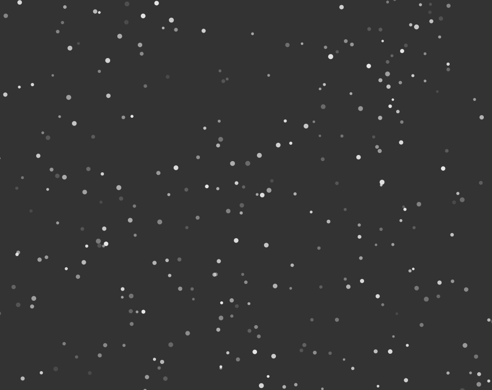
Rotating Starry Sky:
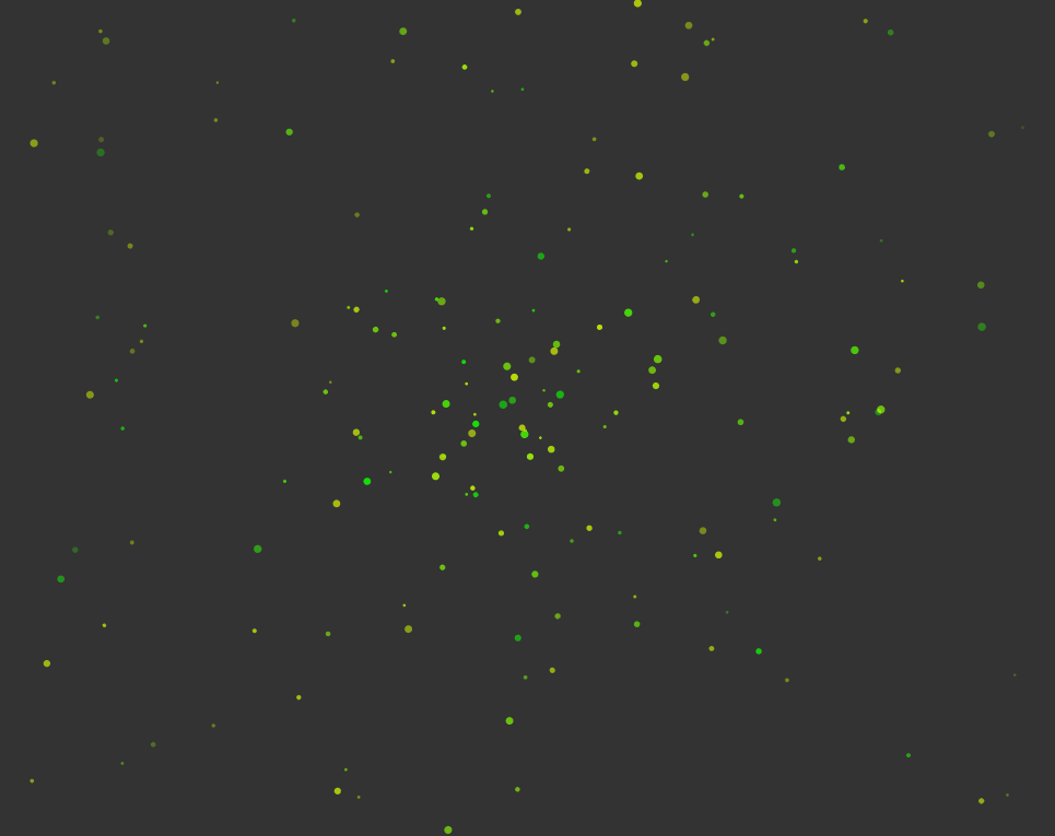
Star contour and star elements:

Custom contour and triangle elements:

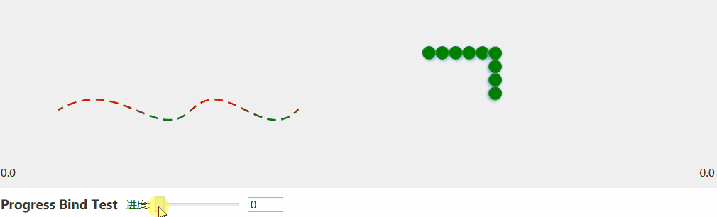
Path flow animation control
This control that can make any control flow along a specified path, allowing you to specify the element template and the flow direction.
Basic Usage
Add namespace
xmlns:control="clr-namespace:IceSky.WpfAnimation.Controls;assembly=IceSky.WpfAnimation"Use control in xaml
<control:PathFlowControl Data="{Binding Text}"/>Parameters (all parameters support data binding)
- Data: The data of path
- Stroke: Stroke of path, effective when ElementTemplate is null
- StrokeThickness: StrokeThickness of path, effective when ElementTemplate is null
- StrokeDashArray: StrokeDashArray of path, effective when ElementTemplate is null
- StrokeDashOffset: StrokeDashOffset of path, effective when ElementTemplate is null
- StrokeStartLineCap: Path start point style
- StrokeEndLineCap: Path end point style
- AnimationSpeed: Unit is second
- Direction: Animation direction, can be set to Forward, Reverse, or Alternate.
- IsLoop: Default is true, when set to false, it only runs once
- ElementTemplate: Custom element template, default is null, use dashed lines to display animation, can use DataTemplate to set element template
- ElementCount: Number of custom elements, effective after setting ElementTemplate
- ElementSpacingRatio: Custom element spacing ratio: when =1, the elements are tightly adjacent with zero spacing; when <1, the elements overlap; when >1, there is blank spacing between the elements
- ShowPathOutline: Whether to show path outline
- FlowProgress: Get or set animation progress
Animation control method
- StartAnimation
- StopAnimation
- PauseAnimation
- ResumeAnimation
Progress Control Example:
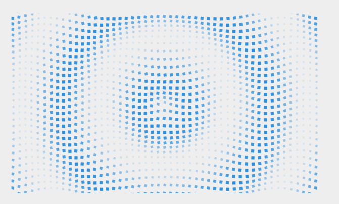
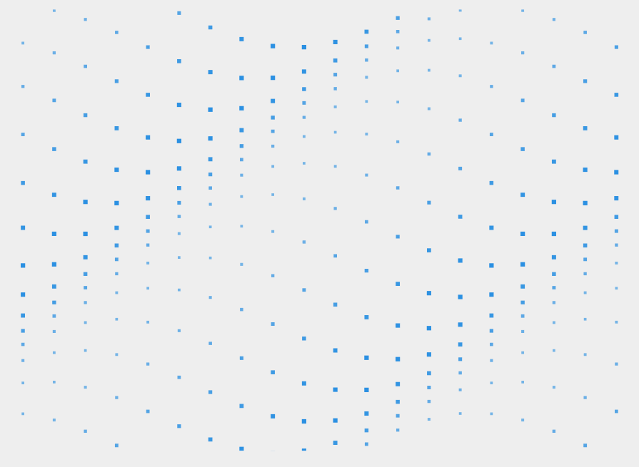
Grid animation control
This is a control for animating grid layout elements, supporting custom grid element styles, layouts, and animation parameters, and it also allows custom animation functions
Basic Usage
Add namespace
xmlns:control="clr-namespace:IceSky.WpfAnimation.Controls;assembly=IceSky.WpfAnimation"Use control in xaml
<control:GridElementControl RowCount="10" ColumnCount="10"/>Parameters (all parameters support data binding)
RowCount: Number of grid rows
ColumnCount: Number of grid columns
ElementWidth
ElementHeight
HorizontalSpacing
VerticalSpacing
RowOffsetStep: Horizontal offset
ColumnOffsetStep: Vertical offset
ContainerPath: You can use Geometry to specify the contour shape
FillElementTemplateConfig: Styles of elements within the container
- Defining element styles requires adding namespace
xmlns:model="clr-namespace:IceSky.WpfAnimation.Models;assembly=IceSky.WpfAnimation"- Custom Style Example
<control:GridElementControl.FillElementTemplateConfig>
  <model:ElementTemplateConfig ShapeType="Rectangle">
     <model:ElementTemplateConfig.ElementStyle>
       <Style TargetType="Shape">
          <Setter Property="Fill" Value="#2A90E2"/>
       </Style>
     </model:ElementTemplateConfig.ElementStyle>
  </model:ElementTemplateConfig>
</control:GridElementControl.FillElementTemplateConfig>
BackgroundElementTemplateConfig: The styles of elements that exceed the container, effective when container path is not null
Animation: Animation type, you can use custom animations inherited from GridAnimation, and the animation parameters include:
- Duration: Animation Duration (seconds)
- IsLoop
- MaxScale: Maximum scale of the element
- MinScale: Minimum scale of the element
- MinOpacity: Minimum opacity of the element
- ItemRotateSpeed: The angle of the element rotates per second
- CenterX: The X parameter of RenderTransformOrigin
- CenterY: The Y parameter of RenderTransformOrigin
AutoStartAnimation: Whether to start automatically
AnimationCenterX: The X coordinate of the animation center
AnimationCenterY: The Y coordinate of the animation center
Animation control method
- StartAnimation: The parameter is the animation object that needs to be executed
- StopAnimation
- PauseAnimation
- ResumeAnimation
Custom Animation
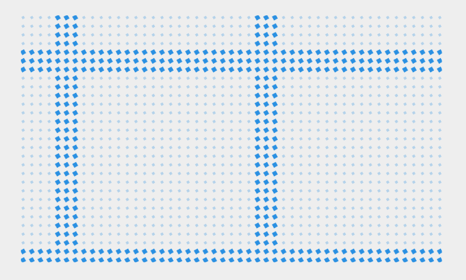
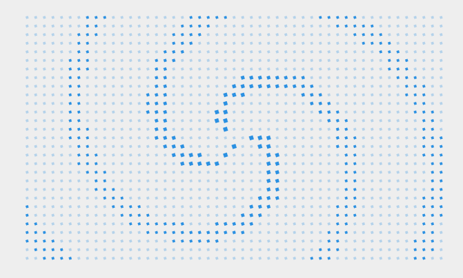
The control library contains multiple predefined grid animations, and each animation has several parameters that can be set, such as:- CircleWaveAnimation: WaveSpeed, WaveAmplitude
- SineWaveAnimation: WaveSpacing, RowOffsetDistance, VerticalAmplitude
- ShockwaveAnimation: WaveWidth
- PerspectiveWaveAnimation: WaveSpeed, PerspectiveIntensity, Amplitude
- ScanLineAnimation: ScanLineCount, ScanLineWidth, IsCrossScan, RotateAngle
- PolygonPulseAnimation: PolygonType, PulseCount, PulseWidth, IsRotatePulse, IsAlternateRotateDir
- SpiralRotateAnimation: SpiralCount, SpiralWidth, SpiralSpacing, CenterRadius, Clockwise
- RadiationRayAnimation: RayCount, RayWidth, DashSpacing, RotateSpeed, Outside
The control supports the use of custom animations. When creating a custom animation, you need to inherit from GridAnimation and implement the following steps:
- Override the abstract method GetElementParams, and in this method return animation parameters of the GridAnimationParams type, including: ScaleX, ScaleY, Offset, Opacity, and Rotation angles. This method will apply transformations to elements at the specified coordinates during each frame update. You can use Progress (the accumulated progress of the animation) or _totalElapsedTime (the total elapsed time of the animation in seconds) for calculations within the method
- Add custom attributes as needed
- Instantiate the animation object in the usage code of this control and set it as a parameter to the StartAnimation
ScanLineAnimation:
RotatePulseAnimation:
XCrossPulseAnimation:
SpiralAnimation:
RayAnimation:
WaveAnimation:
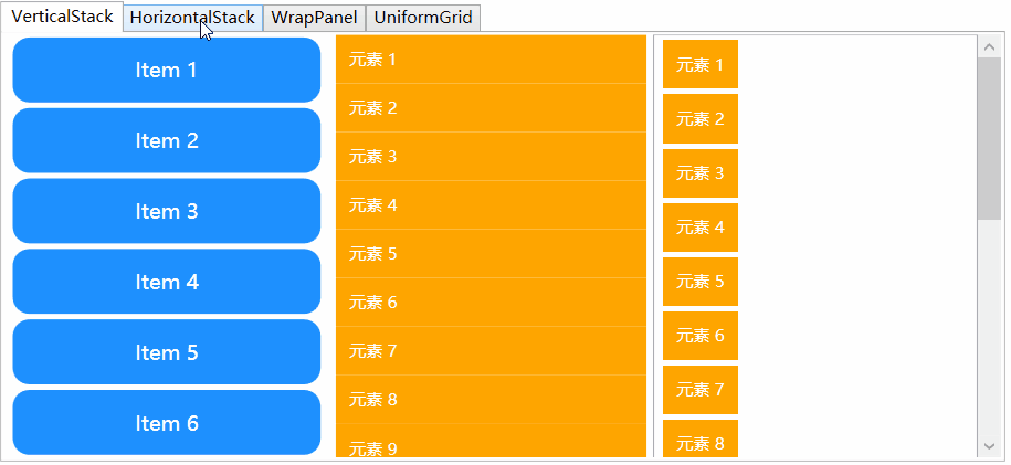
Items Animation
Items animation include two ways to use: AnimatedPanel and ItemsControl animation. AnimatedPanel can animate multiple control elements within a panel by specifying PanelAnimations as common animation component, animation for ItemsControl can be implemented by specifying ItemsPanelTemplate as AnimatedPanel or by adding common animation components to ItemsControl in the ItemTemplate.
Basic Usage
Add namespace
xmlns:control="clr-namespace:IceSky.WpfAnimation.Controls;assembly=IceSky.WpfAnimation"
xmlns:cfg="clr-namespace:IceSky.WpfAnimation.Models;assembly=IceSky.WpfAnimation"
Use control in xaml
<!--AnimatedPanel-->
<ctrl:AnimatedVerticalStackPanel x:Name="panelW" RenderTransformOrigin=".5 .5" AnimationDelay="50">
  <ctrl:AnimatedVerticalStackPanel.PanelAnimations>
    <cfg:AnimationCollection>
      <StaticResource ResourceKey="AC_ScaleFadeIn"></StaticResource>
    </cfg:AnimationCollection>
  </ctrl:AnimatedVerticalStackPanel.PanelAnimations>
</ctrl:AnimatedVerticalStackPanel>

<!--ItemTemplate-->
<ListBox.ItemTemplate>
  <DataTemplate>
    <TextBlock Text="{Binding}" cfg:AnimatedElement.Trigger="VisibleChanged" cfg:AnimatedElement.AnimationDelay="50">
      <cfg:AnimatedElement.Animations>
        <cfg:AnimationCollection>
          <cfg:AnimationSetting BasedOn="{StaticResource AS_MoveFromLeft}" FromValue="-10"/>
          <cfg:AnimationSetting BasedOn="{StaticResource AS_FadeIn}" Duration="500"/>
        </cfg:AnimationCollection>
      </cfg:AnimatedElement.Animations>
    </TextBlock>
  </DataTemplate>
</ListBox.ItemTemplate>
Parameters
- AnimatedPanel type include: AnimatedVerticalStackPanel、AnimatedHorizontalStackPanel、AnimatedWrapPanel、AnimatedUniformGrid,Parameters include PanelAnimations (specifies the common animation component), AnimationDelay (the delay time for each element's animation, in milliseconds), AnimatedOnScrollChanged (whether to animate when the scrollbar changes)
- When adding a common animation component to ItemsControl in ItemTemplate, you can use cfg:AnimatedElement.AnimationDelay to set the animation delay between each element (in milliseconds), and setting cfg:AnimatedElement.Trigger to VisibleChanged allows the animation to occur every time it is displayed