WpfLoading
Introduce
This is a WPF control library that includes dozens of predefined loading animations, a general-purpose loading animation control, a mask overlay control, and an ItemsControl that supports customization.
You can view samples at the following path: IceSky.WpfLoading.Sample
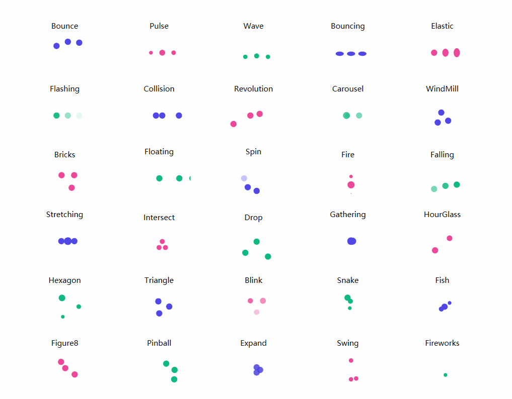
Loading animations
- Blink, Bounce, Bouncing, Bricks, Carousel
- Collision, Drop, Elastic, Expand, Falling
- Figure8, Fire, Fireworks, Fish, Flashing
- Floating, Gathering, Hexagon, HourGlass, Intersect
- Pinball, Pulse, Revolution, Snake, Spin
- Stretching, Swing, Triangle, Wave, WindMill
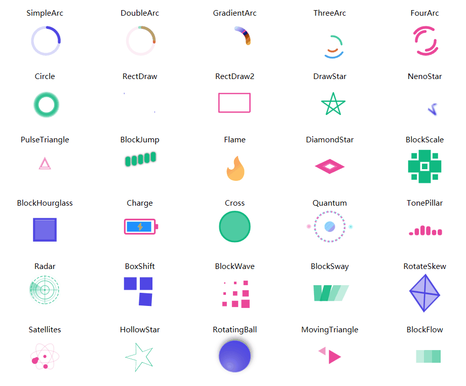
- BlockFlow, BlockHourglass, BlockJump, BlockScale, BlockSway
- BlockWave, BoxShift, Charge, Circle, Cross
- DiamondStar, DoubleArc, DrawStar, Flame, FourArc
- GradientArc, HollowStar, MovingTriangle, NenoStar, PulseTriangle
- Quantum, Radar, RectDraw, RectDraw2, RotateSkew
- RotatingBall, Satellites, SimpleArc, ThreeArc, TonePillar
Basic Usage
- Add reference namespace and resource file
xmlns:anim="clr-namespace:IceSky.WpfLoading.Animations;assembly=IceSky.WpfLoading" <Window.Resources> <ResourceDictionary> <ResourceDictionary.MergedDictionaries> <ResourceDictionary Source="pack://application:,,,/IceSky.WpfLoading;component/Generic.xaml"/> </ResourceDictionary.MergedDictionaries> </ResourceDictionary> </Window.Resources> - Add control in XAML file
<anim:Bounce/>
- Modify configuration parameters
- Dot animation settings: Color, Size
- Shape animation settings: Fill, Stroke, StrokeThickness, (certain parameters may be invalid for different animations)
- AnimationSpeed:Animation speed, a double value > 0, specifying the multiplier for the default speed; > 1 speeds up, < 1 slows down
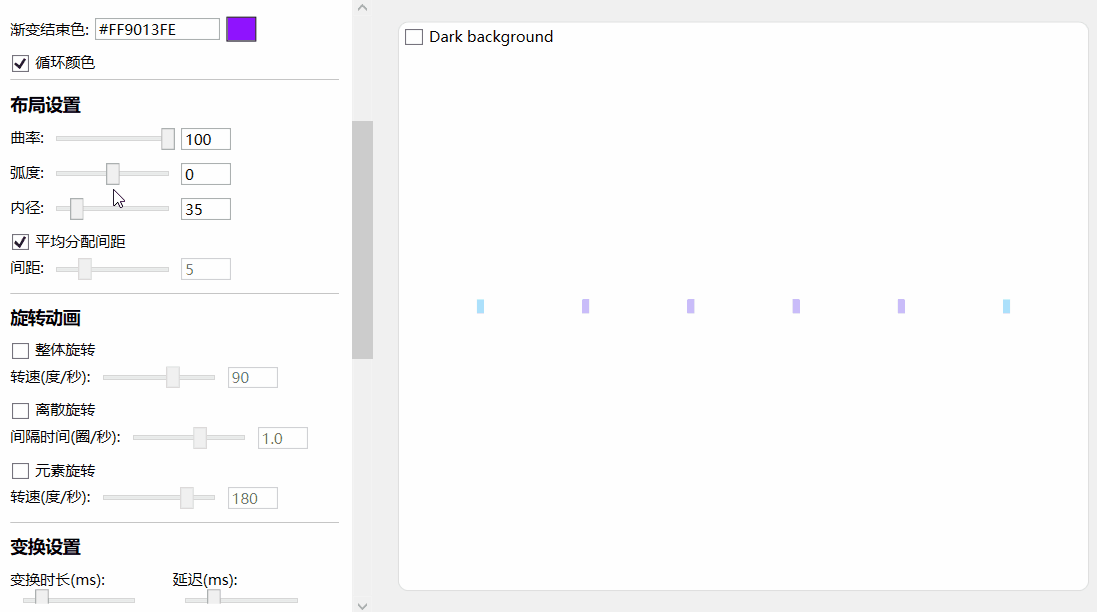
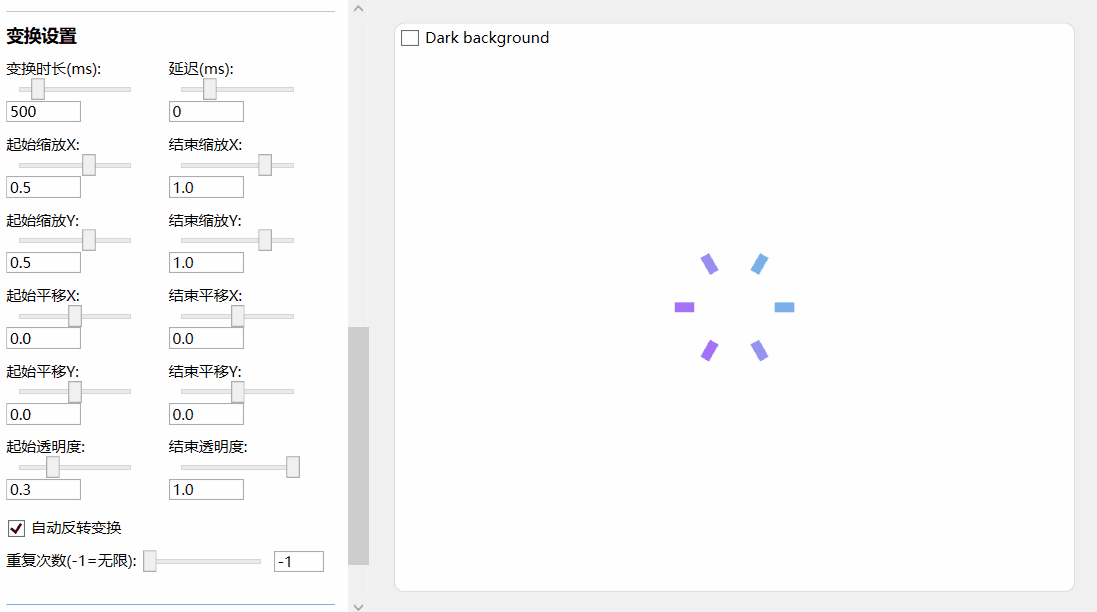
Common loading contorl
- Basic settings: item width, item height, count, border radius
- Color settings: start and end point colors, and whether the color cycles
- Layout settings: curvature, arc, inner radius, spacing
- Rotation settings: ring rotation, discrete rotation, item rotation
- Transform settings: duration, delay, scale, offset, opacity
Basic settings
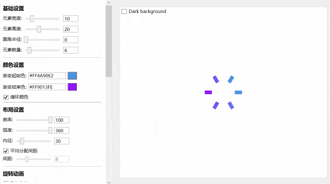
Color settings
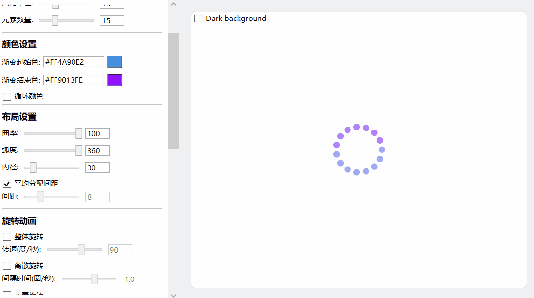
Layout settings:
Rotation settings:
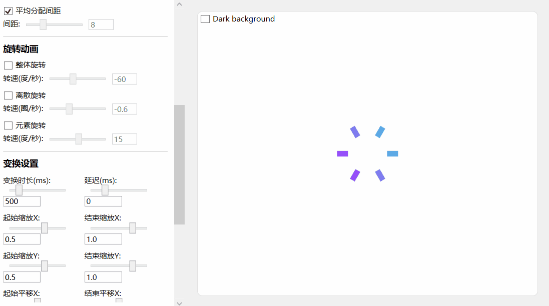
Transform settings:
Basic Usage
Add reference namespace and resource file
xmlns:anim="clr-namespace:IceSky.WpfLoading.Animations;assembly=IceSky.WpfLoading"
<Window.Resources>
   <ResourceDictionary>
      <ResourceDictionary.MergedDictionaries>
            <ResourceDictionary Source="pack://application:,,,/IceSky.WpfLoading;component/Generic.xaml"/>
      </ResourceDictionary.MergedDictionaries>
   </ResourceDictionary>
</Window.Resources>
Add control in XAML file
You can set up the parameters in the designer, then click the 'Copy Code' button below the parameters to copy it, and paste it wherever you want to use it.
The automatically generated code namespace may not match the one defined in the references, please check and modify it!
Copied code example:
<local:GradientLoadingControl
  CornerRadius="6"
  Count="12"
  IsRingRotation="True"
  DelayTime="100"/>
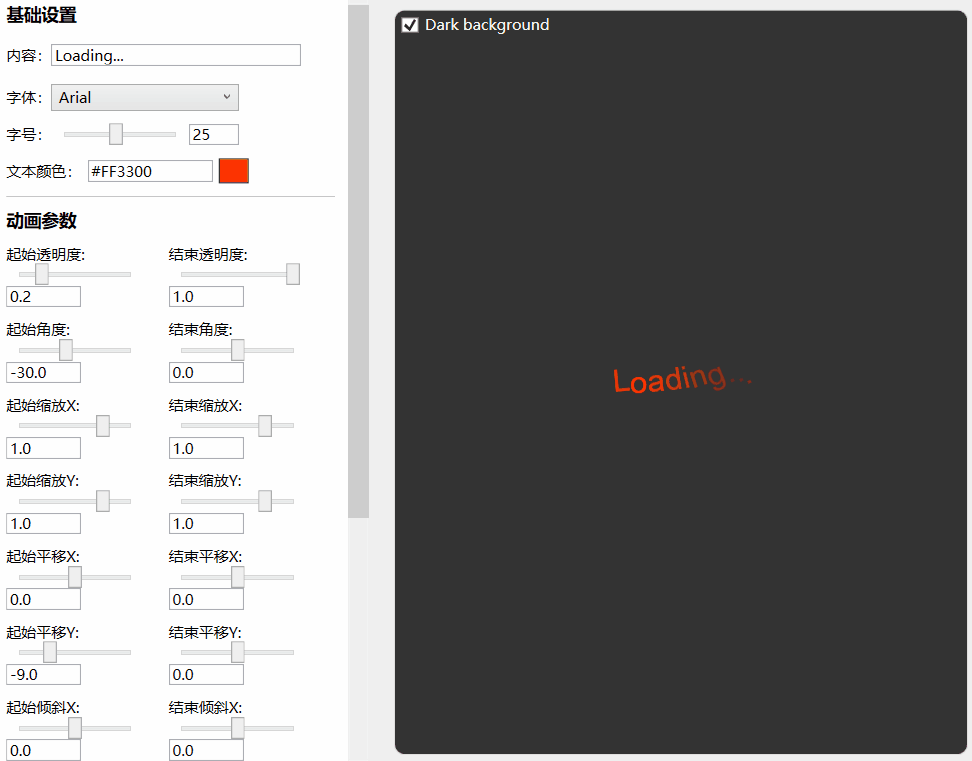
TextAnimations
- Basic settings: Text, FontFamily, FontSize, Color
- Transform settings: Opacity, Rotation, Scale, Offset, Skew
- Animation settings: Duration, Delay, AutoReserve, RepeatCount
Basic Usage
Add reference namespace and resource file
xmlns:anim="clr-namespace:IceSky.WpfLoading.Animations;assembly=IceSky.WpfLoading"
<Window.Resources>
   <ResourceDictionary>
      <ResourceDictionary.MergedDictionaries>
            <ResourceDictionary Source="pack://application:,,,/IceSky.WpfLoading;component/Generic.xaml"/>
      </ResourceDictionary.MergedDictionaries>
   </ResourceDictionary>
</Window.Resources>
Add control in XAML file
You can set up the parameters in the designer, then click the 'Copy Code' button below the parameters to copy it, and paste it wherever you want to use it.
The automatically generated code namespace may not match the one defined in the references, please check and modify it!
Copied code example:
<anim:TextLoadingControl
   TextColor="#FFFF3300"
   FontFamily="Arial"
   FontSize="25"
   OpacityFrom="0.2"
   RotateFrom="-30"
   TranslateYFrom="-9"
   CharacterDelay="150"/>
Mask Layer
- Options
- Blur background
- Mask color
- Mask opacity
- Event
- Open
- OpenWithTask
- Close
Basic Usage
Add reference namespace and resource file(✳The namespace of this control is different from the previous)
xmlns:control="clr-namespace:IceSky.WpfLoading;assembly=IceSky.WpfLoading"
<Window.Resources>
   <ResourceDictionary>
      <ResourceDictionary.MergedDictionaries>
            <ResourceDictionary Source="pack://application:,,,/IceSky.WpfLoading;component/Generic.xaml"/>
      </ResourceDictionary.MergedDictionaries>
   </ResourceDictionary>
</Window.Resources>
Add control in XAML file
<control:MaskPanel x:Name="maskPanel"
          TargetBlurElement="{Binding ElementName=BusinessGrid}">
          ……
          Content in the mask layer
          ……
</control:MaskPanel>
TargetBlurElement: the container that contains content to be blurred
Add open/close logic in the .cs file
//Normal open, needs to close manually
maskPanel.Open();
//Close
maskPanel.Close();

//Open with task, and will automatically close when task complete or timeout
maskPanel.OpenWithTask(task, taskCts, 3000);
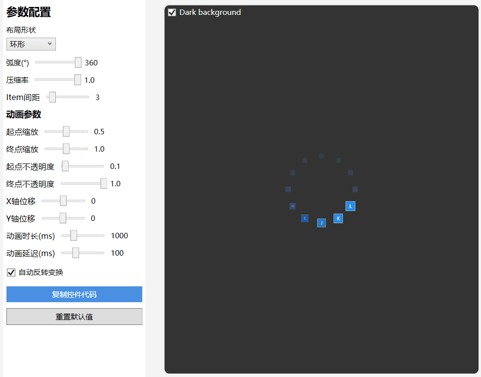
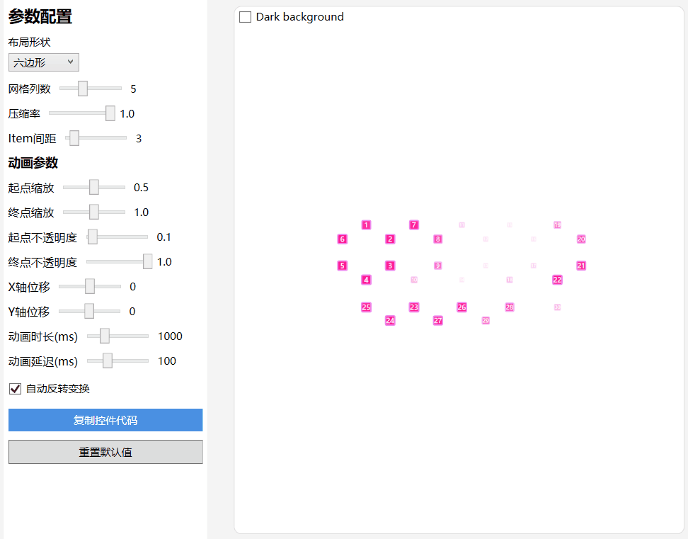
Custom ItemsControl
- Layout types: Linear, Circular, Triangle, Hexagon, Rhombus
- Triangle and hexagon support edge layout and grid layout.
- Supports custom parameter animations for scaling, offset, and transparency
Circular Layout:
Hexagon Grid Layout:
Basic Usage
Add reference namespace and resource file
xmlns:control="clr-namespace:IceSky.WpfLoading;assembly=IceSky.WpfLoading"
<Window.Resources>
   <ResourceDictionary>
      <ResourceDictionary.MergedDictionaries>
            <ResourceDictionary Source="pack://application:,,,/IceSky.WpfLoading;component/Generic.xaml"/>
      </ResourceDictionary.MergedDictionaries>
   </ResourceDictionary>
</Window.Resources>
Add control in the XAML file and set the style
<control:AnimateItemsControl>
   <control:AnimateItemsControl.ItemTemplate>
       <DataTemplate>
           <Border Background="Green" Width="20" Height="20" BorderBrush="Red" BorderThickness="1"/>
       </DataTemplate>
   </control:AnimateItemsControl.ItemTemplate>
</control:AnimateItemsControl>